Since I love working with shiny sterling silver, taking photos on white has been a bit of a pain. Silver just blends in with a stark white background. So in order to show my products off, I developed a looks that is consistent with my work; using natural stone as a background. And since I work with metal and stone, my photos tended to have a bit of a hard light to them.
In other words, they are not soft and glowing on a winter white background.
This week, I have discovered another reason for me to try to perfect the Etsy look. I have applied to several "indie" shows in my area and have been rejected to them. I thought maybe it was me, but someone pointed out that it could easily be my photos.
Unbeknownst to my, many of my local indie shows prefer the photos submitted for juried shows to have this soft white Etsy look. So I now know that one reason I have not been accepted to these shows was that I was using the wrong photo format for my juried shows.
So have decided to rethink my Etsy photos (again). I even went out and bought a book entitled "The crafter's guide to taking great photos"
It is actually very insightful, and the book is helping to correct some of the assumptions I have had involving the Etsy look. So if you are struggling like I am to take those photos, it may be worth looking into.
Here is an example on how I changed one photo from my original to make it a little softer for Etsy.
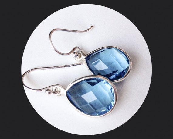 |
| The original photo I was using. Notice the hard edges and light. |
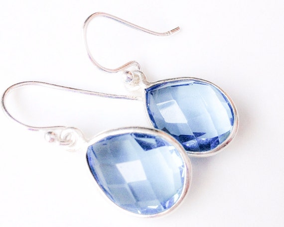 |
| The same photo, just softened a bit. |
So anyway, next year I plan to have two sets of photos for my juried shows. The type that I have normally been using for art shows, and a softer looking photo for Indie shows.
Great idea, April. Thanks for the tip.
ReplyDelete